
We all remember certain seasons – the really wet ones, the dry years and those when the grass just seemed to keep growing.
But how do they compare with more than 130 years of history?
The Long Paddock Rainfall and Pasture Growth Map App lets you explore rainfall and modelled pasture growth across Australia from the late 1800s to today.
It won’t tell you what next season will bring, but it can put the seasons you’ve experienced into a much longer-term perspective.
The app groups Queensland’s rainfall history into longer Wet and Dry periods. These aren’t simply blocks of particularly wet or dry individual years. Researchers identified longer sequences of generally wetter and drier conditions across Queensland’s major grazing lands, with periods lasting at least five years.
Importantly, a Wet period (for Queensland) doesn’t mean everywhere was wet, just as a Dry period doesn’t mean everywhere was dry. The maps show how differently conditions varied across Australia within each period. They’re designed to show regional patterns and put past seasons into perspective, rather than guide decisions on an individual property or paddock.
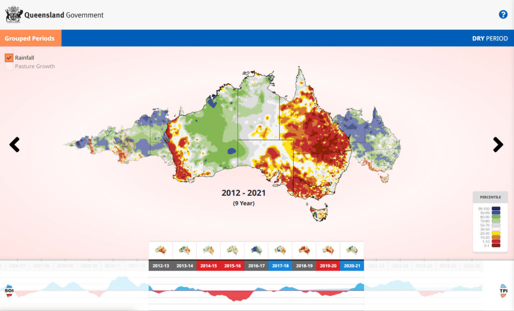
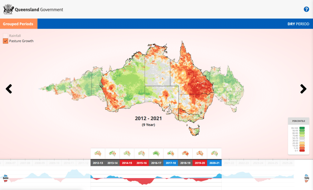
The colours are percentiles, showing how conditions at each location compare with historical records – rather than the actual millimetres of rain or amount of pasture grown. For example, areas above the 90th percentile were among the wettest or highest pasture-growth periods on record, while those below the 10th percentile were among the lowest.
How to use the app
It can take a little exploring to get your bearings, so here’s a simple way to start.
1. Choose a Wet or Dry period.
Use the timeline to select a Wet or Dry period, such as the nine-year Dry period from 2012–2021 or five-year Wet period from 2021–2026.
2. Compare rainfall and pasture growth across the whole period.
The main map shows rainfall or modelled pasture growth across the full period you’ve selected, rather than for an individual year. For example, selecting 2012–2021 shows the entire nine-year Dry period.
Use the selection boxes at the top left of the map to switch between Rainfall and Pasture Growth. Look at where the higher and lower percentiles occur and how the patterns differ. Use the left and right arrows to move forwards or backwards through the Wet and Dry periods.
3. Move through the individual years.
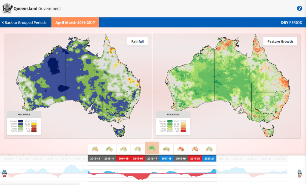
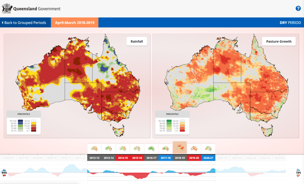
Use the carousel below the map to select an individual year within your chosen Wet or Dry period. Selecting a year opens rainfall and modelled pasture growth side by side for that April–March period.
Long Paddock uses April–March periods to keep northern Australia’s main summer rainfall season together, which better aligns with the El Niño–Southern Oscillation cycle. As you move through the years, the maps change, allowing you to see how rainfall and pasture growth varied from one year to the next.
4. Look for a season you remember.
Find a year that stands out on your property. How does it compare with the surrounding years? Does the pasture growth map tell the same story as rainfall?
To go further back, return to the timeline and select an earlier Wet or Dry period, then explore the individual years within it. You can keep going back to seasons your parents or grandparents talked about, and eventually to the late 1800s.
You’ll also see years identified as El Niño, La Niña or Neutral, along with the Southern Oscillation Index (SOI) graph. These describe the broader El Niño–Southern Oscillation conditions, rather than how much rain actually fell. For example, a Neutral year doesn’t necessarily mean average rainfall, it simply means the year wasn’t classified as either El Niño or La Niña.
Beyond your own records
Few grazing businesses have detailed rainfall records stretching back to the late 1800s, let alone pasture growth information.
That’s perhaps the real value of the app. It provides a simple way to step outside the seasons within living memory and see just how variable rainfall and pasture growth have been for more than a century.
Click here to explore the Rainfall and Pasture Growth Map App
